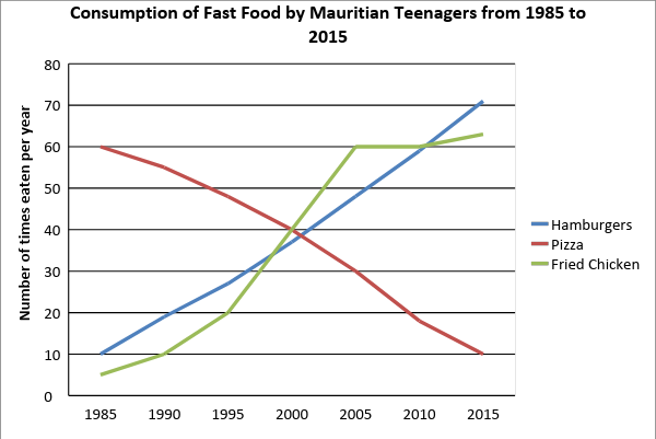
The chart illustrates consumption of three kinds of fast food by teenagers in Mauritius from 1985 to 2015.
Summarise the information by selecting and reporting the main features, and make comparisons where relevant.
Write at least 150 words.

In your IELTS Academic Writing Task 1 preparation, you'll need to practice a total of 7 IELTS Academic Writing Task 1 data types. In this post, we'll look at the Line Graphs in IELTS Academic Writing Task 1 questions in detail and provide you with many line graphs practice questions.
In a line graph, there are usually multiple lines that show changes over time. In your writing, you need to group information based on lines having similar trends or values, so your essay structure will be as follows:
We will use this essay structure for all line graph questions. Now, let’s join IELTS Instructor Tina below to learn how to approach IELTS Writing Task 1 Line Graphs questions.
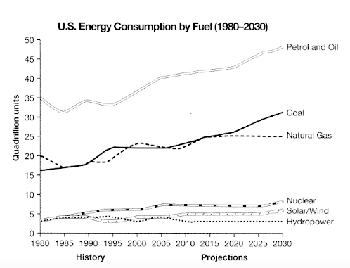
The graph below gives information from a 2008 report about consumption of energy in the USA since 1980 with projections until 2030. Summarise the information by selecting and reporting the main features and make comparisons where relevant. Write at least 150 words.
Model Essay
Important functional words are highlighted in red
Useful vocabulary and phrases are highlighted in green
Synonyms and topic vocabulary are highlighted in blue
The given line graphs illustrates data from a report in 2008 regarding energy consumption in the USA since 1980 with predictions until 2030.
Overall, fossil fuels have shown increases in consumption since the start of the period, with expectations for even more reliance on these fuel sources. Cleaner energy sources have accounted for considerably less consumption with predictions for a similar trend.
Regarding fossil fuels such as coal, natural gas, petrol and oil, they have seen steady increases in energy consumption since 1980. Petrol and oil started at 35 quadrillion units in 1980, then fluctuated until 2000, at which point they rose steadily with a prediction of over 45 quadrillion units by 2030. Additionally, coal followed a similar rising trend. It is predicted that it will have surpassed 30 quadrillion units by 2030. Natural gas usage and it is set to level off at around 24 quadrillion units from 2020 onwards.
In contrast, cleaner energy fuel sources all began the period at under 5 quadrillion units and showed declines in their use, with the exception of nuclear, which climbed slightly to 6 quadrillion units in 2005 with solar/wind expecting to see slight increases . Hydropower is projected to remain relatively unchanged until 2030.
PRACTICE QUESTION 1 ON OUR IELTS APP
The chart illustrates consumption of three kinds of fast food by teenagers in Mauritius from 1985 to 2015. Summarise the information by selecting and reporting the main features, and make comparisons where relevant. Write at least 150 words.
Model Essay
Important functional words are highlighted in red
Useful vocabulary and phrases are highlighted in green
Synonyms and topic vocabulary are highlighted in blue
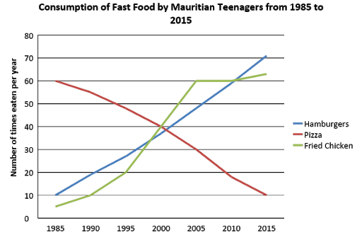
The line graph depicts the consumption of three types of fast food, (hamburgers, pizza, and fried chicken) over a 30 year period by Mauritian teenagers. Units are given as the number of times each kind was eaten per year.
Overall, hamburgers and fried chicken had become the most popular foods by 2015 with the biggest increase in numbers eaten, while pizza that was the most widely-eaten at the start, declined precipitously in popularity.
With regards to hamburgers, consumption showed a steady upward trajectory from 10 times eaten per year to over 70 times. Likewise, teenagers in Mauritius ate fried chicken only 5 times per year in 1985 before rising dramatically to a plateau in 2005, then increased slightly at the end of the period to finish as the second most popular food.
On the contrary, although pizza was the most popular food with Mauritian adolescents in 1985, its consumption fell continuously from 60 times a year to just 10 pizzas by the last year.
PRACTICE QUESTION 2 ON OUR IELTS APP
Now that you're familiar with the IELTS Writing Task 1 Line Graphs questions, it's time to practice. Check out the practice questions below.
This section presents a list of common IELTS Academic Writing Task 1 - Line Chart questions. If you want to prepare for the IELTS Writing Test, these questions are a must study.
The chart illustrates consumption of three kinds of fast food by teenagers in Mauritius from 1985 to 2015.
Summarise the information by selecting and reporting the main features, and make comparisons where relevant.
Write at least 150 words.
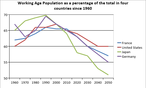
The chart shows the proportion of working age adults in four countries from 1960 to 2015. Units are given in percentages.
Summarise the information by selecting and reporting the main features, and make comparisons where relevant.
Write at least 150 words.
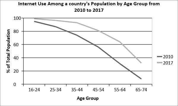
The chart illustrates Internet usage among a country’s population given by age group in 2010 and 2017.
Summarise the information by selecting and reporting the main features, and make comparisons where relevant.
Write at least 150 words.
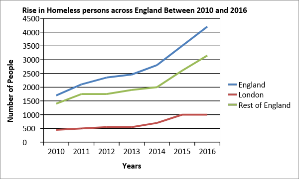
The line graph shows a rise in homeless persons across England from 2010 to 2016.
Summarise the information by selecting and reporting the main features, and make suitable comparisons where relevant.
Write at least 150 words.
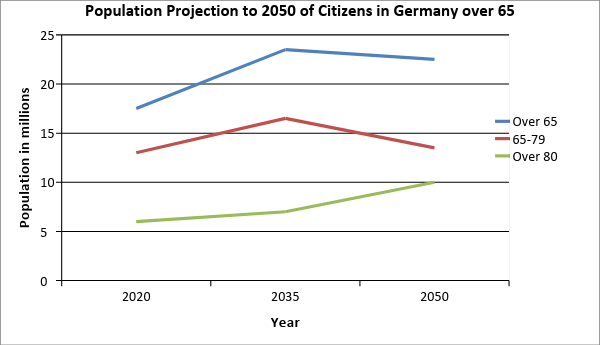
The line graph below shows population projections (millions) for German citizens over 65 from 2020 to 2050.
Summarise the information by selecting and reporting the main features making comparisons where relevant.
Write at least 150 words.
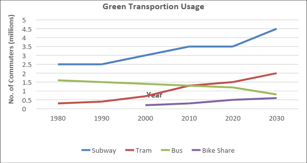
The line graph below shows the monthly ridership of four separate transportation forms in a European metropolitan area between 1980 and 2030.
Summarise the information by selecting and reporting the main features making comparisons where relevant.
Write at least 150 words.
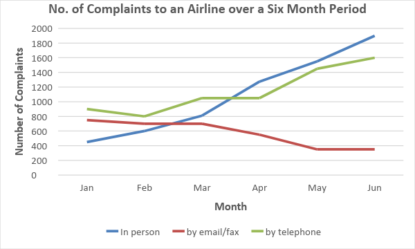
The line graph below shows the number of complaints received by the complaints department of a single airline over a six-month period in 2009.
Summarise the information by selecting and reporting the main features making comparisons where relevant.
Write at least 150 words.
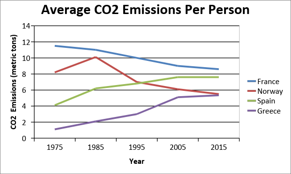
The chart illustrates average CO2 emissions per person in four European countries between 1975 and 2015.
Summarise the information by selecting and reporting the main features, and make comparisons where relevant.
Write at least 150 words.
The graph below gives information from a 2008 report about consumption of energy in the USA since 1980 with projections until 2030.
Summarise the information by selecting and reporting the main features, and make comparisons where relevant.
Write at least 150 words.
