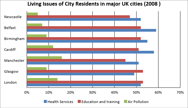
The chart below gives some of the most reported issues among people living in UK cities in 2008 (%).
Summarise the information by selecting and reporting the main features, and make comparisons where relevant.
Write at least 150 words.

In your IELTS Academic Writing Task 1 preparation, you'll need to practice a total of 7 IELTS Academic Writing Task 1 data types. In this post, we'll look at the bar charts in IELTS Academic Writing Task 1 questions in detail and provide you with many bar chart practice questions.
Bar charts are pretty common in IELTS writing task 1 academic. There are three different scenarios you will encounter in a bar chart task:
Each scenario requires you to write the report differently. This post will cover all scenarios. Let’s start with our first bar chart lesson!
In this lesson, you are going to learn how to analyze and write about bar charts with categories on the x axis.
Practice the questions from the video lesson
In this lesson, you are going to learn how to analyze and write about bar charts with dates or years on the axis (functions as a line graph).
In this lesson, you are going to learn how to analyze and write about a question that include two bar charts.
Practice the questions from the video lesson
Now that you're familiar with the IELTS Writing Task 1 Bar Charts questions, it's time to practice. Check out the practice questions below.
This section presents a list of common IELTS Academic Writing Task 1 - Bar Chart questions. If you want to prepare for the IELTS Writing Test, these questions are a must study.
The chart below gives some of the most reported issues among people living in UK cities in 2008 (%).
Summarise the information by selecting and reporting the main features, and make comparisons where relevant.
Write at least 150 words.
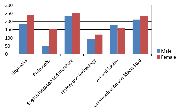
The chart below shows the proportion of male and female students studying six art-related subjects at a UK university in 2011.
Summarise the information by selecting and reporting the main features, and make comparisons where relevant.
Write at least 150 words.
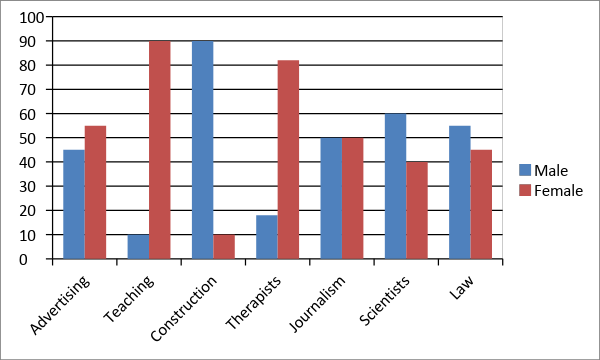
The chart illustrates the percentage of male and female workers in six different professions across the UK in 2007.
Summarise the information by selecting and reporting the main features and make comparisons where necessary.
Write at least 150 words.
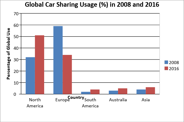
The chart below gives the distribution of worldwide car sharing schemes (%) in 2008 and 2016.
Summarise the information by selecting and reporting the main features, and make comparisons where necessary.
Write at least 150 words
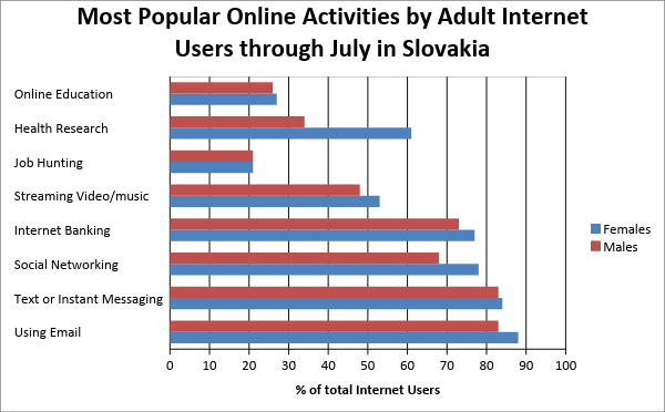
The bar chart gives the top eight online activities in Slovakia in a given month.
Summarise the information by selecting and reporting the main features, and make comparisons where necessary.
Write at least 150 words
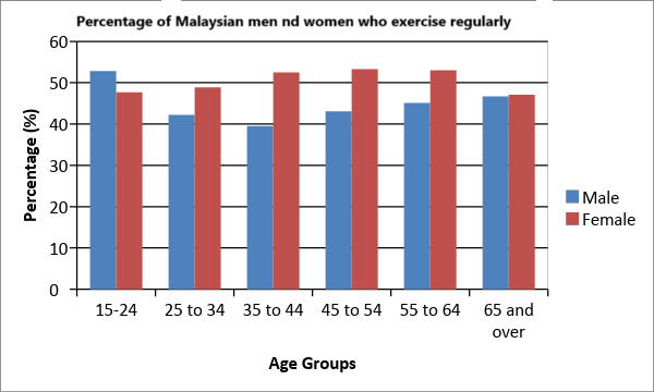
The chart below shows the proportion of males and females in Malaysia who commonly do physical activity in 2010.
Summarise the information by selecting and reporting the main features, and make comparisons where necessary.
Write at least 150 words
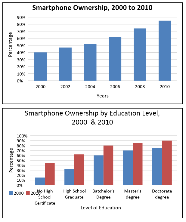
The graphs below give information concerning smartphone ownership as a percentage of population in a country from 2000 to 2010, and by level of education for the years 2000 and 2010.
Summarise the data by selecting and reporting the main features and make comparisons where relevant.
Write at least 150 words.
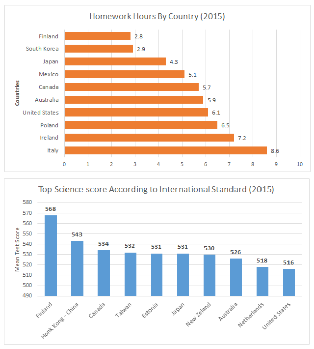
The bar charts show education data related to young adults aged 15 years in 10 different countries in 2015. The first chart shows in which countries adolescents do the most homework in terms of hours per week. The second chart shows the nations that scored the best on an international science test.
Summarise the data by selecting and reporting the main features and make comparisons where relevant.
Write at least 150 words.