The pie chart below shows the percentage of ad spending by different kinds of media in India from 2012 to 2017.
Summarise the information by selecting and reporting the main features, and make comparisons where relevant.
Write at least 150 words.

In this article, you are going to learn how to analyze and write about pie charts in the IELTS Academic Writing Task 1. You will also see a list of common pie charts IELTS writing questions. If you want to prepare for the IELTS Writing Test, these IELTS writing questions are a must-study.
IELTS Academic Writing task 1 uses the same structure for all tasks regardless if it is a pie chart, line graph, table, bar graph, or a mix of multiple charts. The structure is as follows:
So the steps to write the report for this task is very simple:
One important point to remember is that we have to write facts and compare data in task 1, no opinion is given here and no conclusion is needed.
Okay! Now let’s look at pie charts specifically.
You need to know that in an IELTS writing pie chart question, you might see two pie charts or one pie chart. If you see two pie charts in a question, you will have to compare them in your writing. However, if there is only one pie chart, you will need to discuss the information you observe. As you can see, the strategies are quite different, so it’s important you are prepared for both question types.
Now let’s get started! We will first look at an example question where one pie chart is provided.
Step 1: Analyse the chart(s) and plan how to group the information
Typically, a single pie chart question is straightforward and relatively easy to group the information; We just need to look at each segment and figure out how much of a percentage each segment makes up. This is really simple and after that, you’ll notice there is one segment that is the largest and one that is the smallest. These two segments are a good starting point, which you’ll see in the analysis table below.
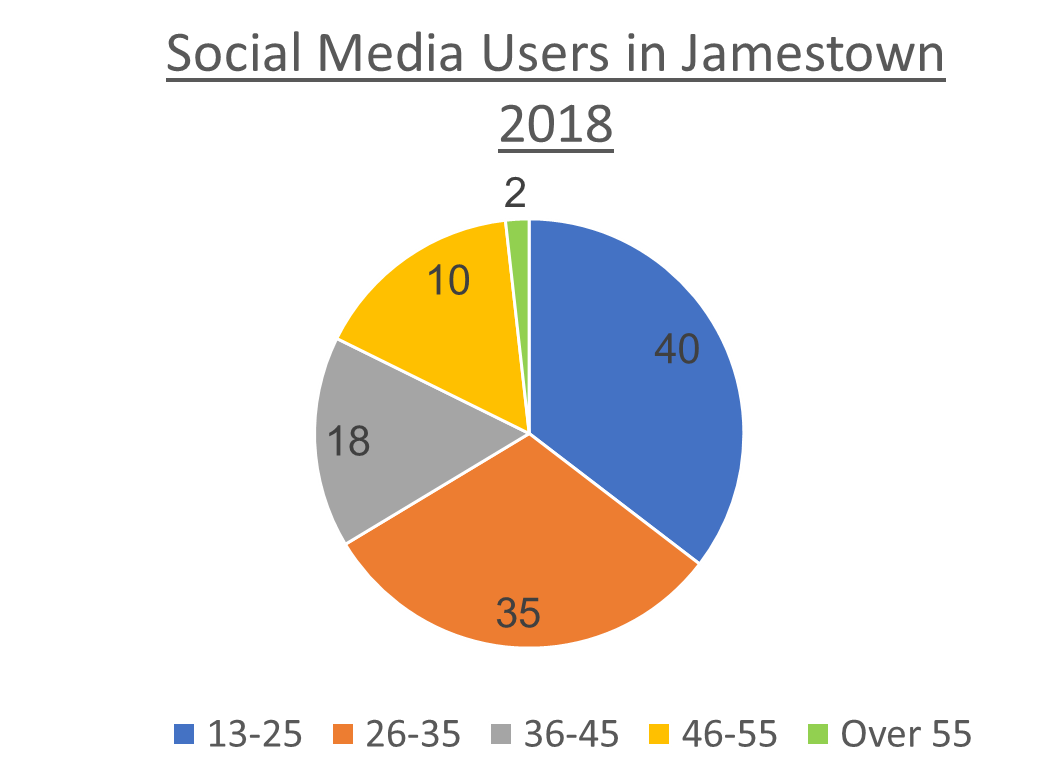
| The first grouping: age groups used social media more | Age group 13-25: 45% Age group 26-15: 35% |
| The second grouping: age groups used social media less | Aged over 55: 2% Age group 46-55: 10% Age group 36-45: 18% |
Now, we need to see if there is a trend. As you can see, the general trend is that the older a person was in 2018 in Jamestown, the less likely they were to use social media. This observation would make a very good addition to your piece of writing, because it summarises what the chart is really all about.
Step 2: Write an essay using the recommended essay structure
Now that you’ve analyzed the task and figured out how to group the information, let’s write the essay. We recommend you stop here and actually write an essay using the language we’ve taught in previous lessons! Come back to this lesson to check the model essay and analysis.
Model Essay
The chart below gives the percentage of social media users by age in Jamestown in 2018. Summarise the information by selecting and reporting the main features. Write at least 150 words.

Important functional words are highlighted in red
Useful vocabulary and phrases are highlighted in green
Synonyms and topic vocabulary are highlighted in blue
Introduction
The given pie chart provides information about the proportion of people using digital networking according to age group for Jamestown for the year 2018.
Original task question:
The chart below gives the percentage of social media users by age in Jamestown in 2018. Summarise the information by selecting and reporting the main features.
How we paraphrase:
| Task question | Our own words |
| The chart below | The given pie chart |
| gives | Provides information about |
| the percentage of | the proportion of |
| social media users | people using digital networking |
| by | according to |
| age | age group |
| in Jamestown | for Jamestown |
| in 2018 | for the year 2018 |
Overview
Overall, the general trend of Jamestown’s social media users during 2018 was that the older a person was, the less likely they were to use digital networking.
Body paragraph 1
In terms of the most significant feature of the chart, the largest category of digital communicators was the group aged 13 to 25, which accounted for 40% of the total users. In addition, the next important segment of the population using social media, was those aged between 26 and 35. This group’s contribution was slightly lower at 35%. Moreover, added together, these two categories made up more than half of all those who used social media platforms in 2018, in Jamestown. They accounted for the vast majority of users, at 75%.
Body paragraph 2
In stark contrast, the category with the lowest percentage of users, people older than 55, comprised a tiny 2% of all users. Furthermore, those between 46 and 55 years of age contributed 10% and people aged 36 to 45 made up 18 per cent.
Now let’s look at the other scenario, where you will need to look at two pie charts. This type is actually much more common and more difficult to analyze. Let’s look at an example.
Step 1: Analyse the charts and plan how to group the information
Here is a top tip for you. One of the most common mistakes that people make when they write about two pie charts is that they don’t compare and contrast them. They write about each pie chart in a separate paragraph. If you do this, you’ll lose marks. The examiner has given you two pie charts on purpose, because they want to see if you can analyse how they fit together. So, you must compare and contrast the two pie charts in your report. Let’s see how to do that.
Here is one way you can group the information, and at the same time, compare and contrast them.
The first grouping
Choose 2-3 segments that account for higher percentages of the first pie chart, and then write about how these segments change from the first pie chart to the second pie chart.
The second grouping
Choose 2-3 segments that account for lower percentages of the first pie chart, and then write about how these segments change from the first pie chart to the second pie chart.
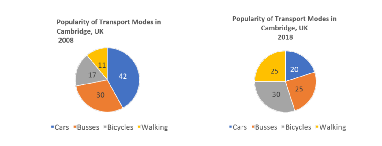
| The first grouping | Cars -> decrease from 42% to 20% Buses -> decrease from 30% to 25% |
| The second grouping | Bicycles -> increase from 17% to 30% Walking -> increase from 11% to 25% |
Alright! Next you need to figure out if there are any trends when comparing the two pie charts.
You can see that human walking and cycling became more popular and cars and buses less popular between the years 2008 and 2018
Some students might add the following in their essay:
This trend can be explained by the increased focus on the environment in cities. People no longer want to use transport that causes pollution, so instead they choose to walk or cycle.
DO NOT DO THIS!
You don’t need to give a reason for the trend. You just need to correctly mention it exists based on the pie charts information.
Step 2: Write an essay using the recommended essay structure
Now that you’ve analyzed the task and figured out how to group the information, let’s write the essay. We recommend you stop here and actually write an essay using the language we’ve taught in previous lessons! Come back to this lesson to check the model essay and analysis.
Model Essay
The charts below provide information on popular modes of transport in the city of Cambridge for the years 2008 and 2018. Summarise the information by selecting and reporting the main features and make comparisons where relevant. Write at least 150 words.

Important functional words are highlighted in red
Useful vocabulary and phrases are highlighted in green
Synonyms and topic vocabulary are highlighted in blue
Introduction
The pie charts compare the popularity of various methods of transportation used in Cambridge in 2008 and 2018.
Original task question:
The charts below provide information on popular modes of transportation in the city of Cambridge for the years 2008 and 2018. How we paraphrase:
| Task question | Our own words |
| the charts below | the pie charts |
| provide information | compare |
| on popular | the popularity of |
| modes of transport | various methods of transportation used |
| in the city of Cambridge | in Cambridge |
| for the years 2008 and 2018 | in 2008 and 2018 |
Overview
Overall, after a decade, the general trend was that Cambridge’s population had moved away from using motorised vehicles, preferred by the majority in 2008, in favour of human propulsion, by 2018.
The second paragraph is where you describe the general trend.
The “past perfect” tense is used to describe how things had changed.
Past perfect: subject + had + past participle + by + year
Sentence: Cambridge’s population had moved away from using motorised vehicles, preferred by the majority in 2008, in favour of human propulsion, by 2018.
Body paragraph 1
In terms of vehicle transport, in 2008, cars were the most popular choice, preferred by 42% of people. This was followed by bus usage at 30%. Moreover, 72% of people used either of these forms of transportation. In contrast, over the next decade personal motor vehicle use declined significantly and by 2018 it was the least popular transport form. On the other hand, the popularity of buses dropped only slightly by 5%.
Body paragraph 2
However, human propulsion, represented by the cycling and pedestrian categories, was unpopular in 2008. Bicycle transport was only chosen by 17% of people and travelling on foot was the least popular choice at 11%. Nevertheless, by 2018, cycling and walking had both experienced a 23% increase in popularity. Their use had more than doubled in popularity.
This section presents a list of common IELTS Academic Writing Task 1 - Pie Chart questions. If you want to prepare for the IELTS Writing Test, these questions are a must study.
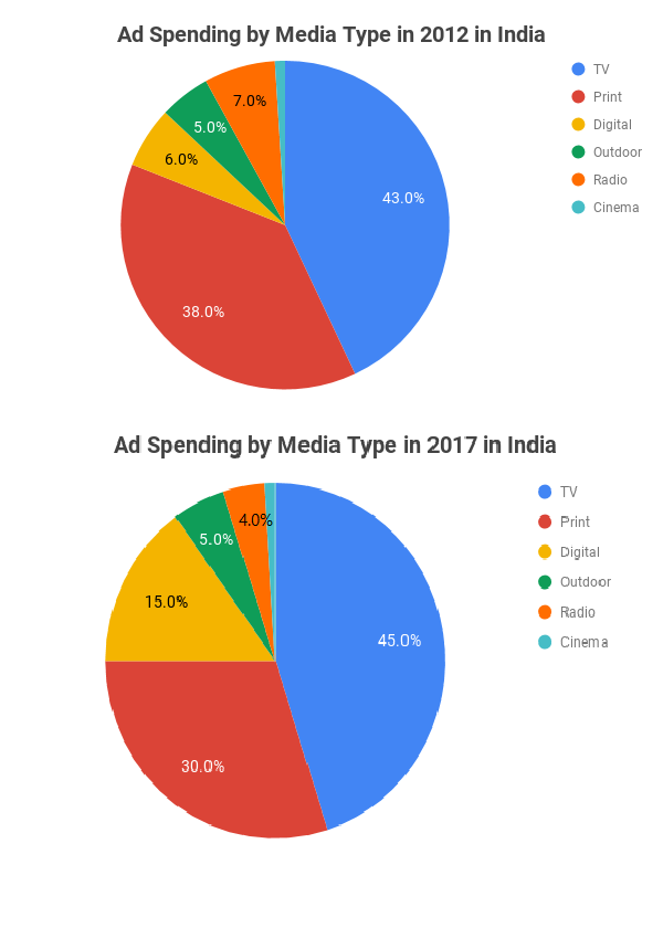
The pie chart below shows the percentage of ad spending by different kinds of media in India from 2012 to 2017.
Summarise the information by selecting and reporting the main features, and make comparisons where relevant.
Write at least 150 words.
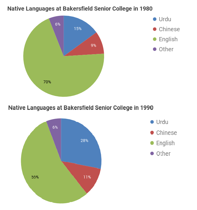
The pie chart below shows the native languages spoken by students at Bakersfield Senior College in two separate years.
Summarise the information by selecting and reporting the main features, and make comparisons where relevant.
Write at least 150 words.
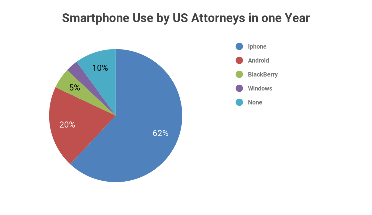
The pie chart below illustrates the different types of smartphones used by attorneys in the U.S. in one year.
Summarise the information by selecting and reporting the main features, and make comparisons where relevant
Write at least 150 words.
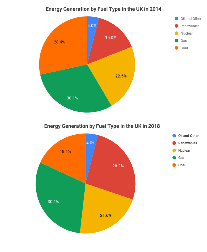
The pie chart below depicts energy generation by fuel type in the UK in two years.
Summarise the information by selecting and reporting the main features, and make comparisons where relevant.
Write at least 150 words.
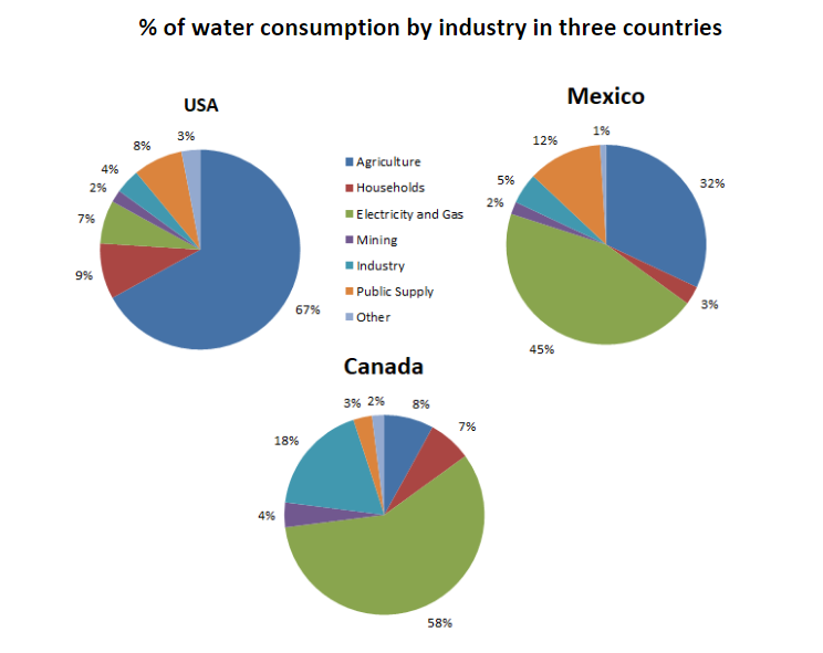
The pie charts below show the proportion of freshwater withdrawals made by various economy sectors in three countries in a given year.
Summarise the information by selecting and reporting the main features, and make comparisons where relevant.
Write at least 150 words.
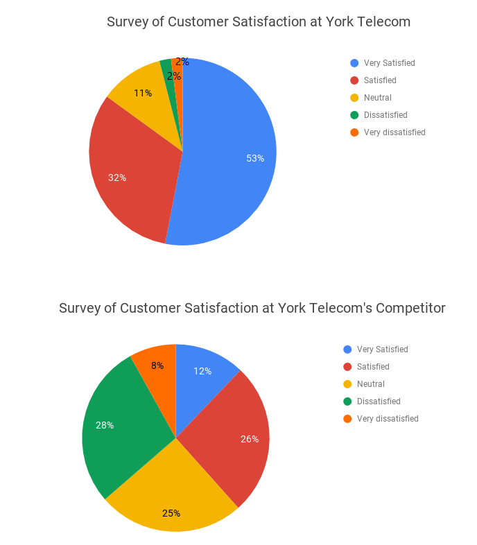
The pie charts below show the results of a customer satisfaction survey comparing the performance of York Telecom and a competitor in April.
Summarise the information by selecting and reporting the main features, and make comparisons where relevant.
Write at least 150 words.
Customer Satisfaction | Industry Average |
Very Satisfied | 41% |
Satisfied | 24% |
Neutral | 10% |
Dissatisfied | 17% |
Very dissatisfied | 8% |
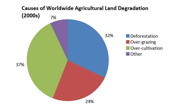
The pie graph depicts the main reasons for the productivity loss of agricultural land worldwide. The table shows how these causes influenced three world regions during the 2000s.
Summarise the information by selecting and reporting the main features, and make comparisons where relevant.
Write at least 150 words.
Causes of Land Degradation by Region (%) | ||||
Region: | Deforestation | Over-cultivation | Over-grazing | Total land degraded |
North America | 0.3 | 3.4 | 1.7 | 5.4 |
Asia | 9.8 | 7.8 | 5.7 | 23.3 |
Australia & Oceania | 1.6 | 0.3 | 11 | 12.9 |
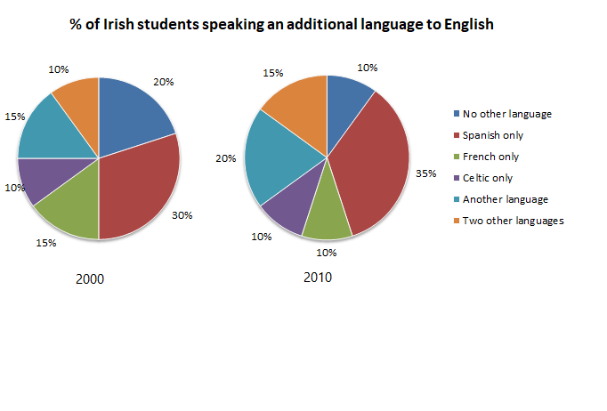
The charts below show the percentage of Irish students at one university who spoke an additional language to English from 2000 to 2010.
Summarise the information by selecting and reporting the main features, and make comparisons where relevant.
Write at least 150 words.
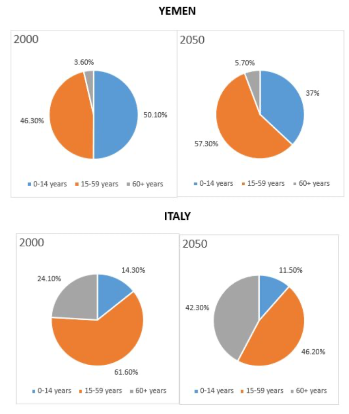
The charts below give information on the ages of the populations of Yemen and Italy in 2000 and projections for 2050. Summarise the information by selecting and reporting the main features, and make comparisons where relevant.
Write at least 150 words.
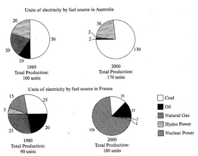
The pie charts below show units of electricity production by fuel source in Australia and France in 1980 and 2000. Summarise the information by selecting and reporting the main features, and make comparisons where relevant.
Write at least 150 words.
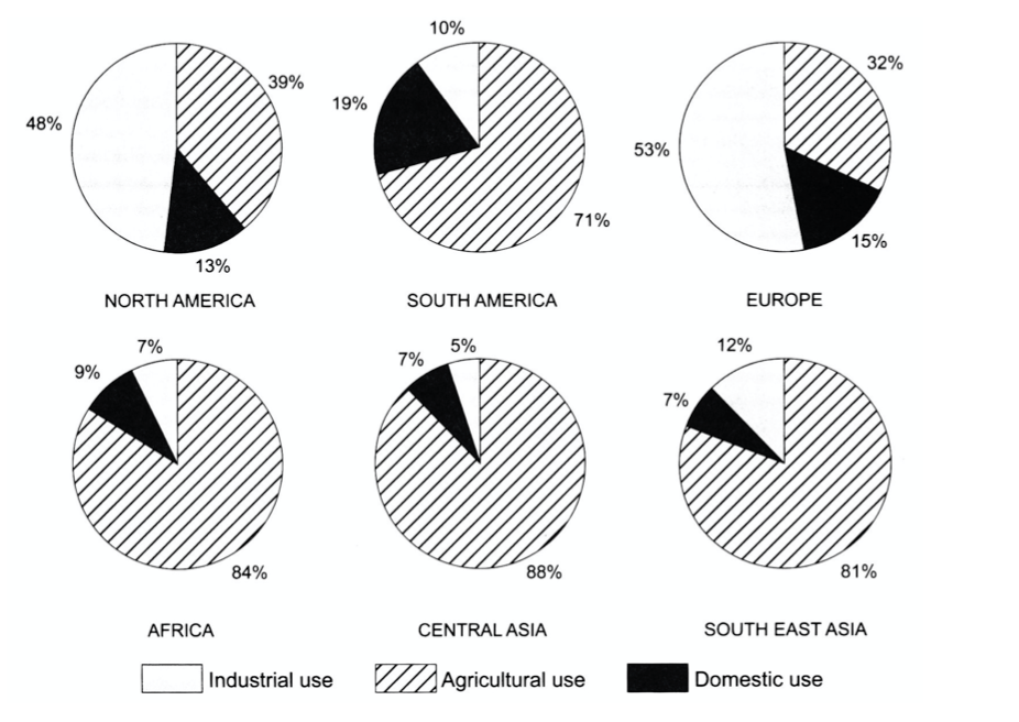
The charts below show the percentage of water used for different purposes in six areas of the world. Summarise the information by selecting and reporting the main features, and make comparisons where relevant.
Write at least 150 words.